


For my final piece I have created a tryptic of 3 digital edits. Each edit is of a different vocalist from a band I listen to.
In my proposal it states that I will create a final piece going down the digital/graphics/photo based route and it will be based around music. So by doing this,I have related back to my proposal and followed it through.
I created my final piece by firstly,using illustrator to go over the out line of the vocalist,this was just a basic outline over the faded template. For this I used the photographs I had taken of them myself at previous gigs I had been to. I then experimented and changed the colour of the line multiple times. I changed it to mainly bright and vibrant colours as I planned to have an edited dulled black and white photograph in the background,so the bright colours would stand out. I then went into photoshop,opened the image I was working from and added multiple filters over the top to see which I preferred. I then layered the bright outline over the dull image and made it slightly offset. I did this with all 3.
Next I started looking into typography and graphic artists who emerge text with photos. I collected a few images I liked and used them to inspire me to layer text over my digital edits. I used a causal font as on one of David Carsons pieces he does and it sits well.. it isn’t too bold,but it isn’t plain. The 2nd designer I looked at inspired me to put my text into a bright font,as themselves used a bright font,over a photograph of a person which is similar to what I was doing. I then repeated this for the following 2 edits.
I decided to go forward with the digital side of art as it is an area that I am most comfortable with,also I have a genuine interest for it as I have used photoshop and illustrator throughout school,also I am good at it. In my proposal it states I was going to go forward down this route.
Overall I am pleased with how my final piece has turned out,as it follows my proposal and as from the start I knew I wanted to do a digital outcome and I have. It relates to my theme of the music industry which is something I am passionate about. My favourite aspect of it is the fact that each edit is a different colour based and slightly more offset,also that each edit is a different person,as originally I planned to do 3 of the same. This way I think it’s more interesting to look at and not as repetitive. There is nothing I would necessarily changed,but If I was too do this again,I would try more complex images and try too add abit more detail and see what it would look like.
David Hockney
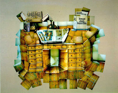
David Hockney is a painter,photographer and joiner from Bradford. Joinery is a collection of photographs which come (join) together to create a final hole outcome. Hockney first discovered ‘joinery’ accidentally,when he took Polaroid shots of his living room,then went on to glue them together,not intending for them to create a composition on their own. After his discovery,he then realized it created a narrative and made it look like the audience as walking through and around the room. After this big discovery he decided to focus more on his photography and new find,wondering how he could take this further.
Mandy besek

Mandy Besek is a textiles artist from Sellinsgrove,Pennsylvania. She specialises in cutting,stitching and appliqué. Her work is inspired by ancient culture and nature; as she has always had an interest in it since she was a child. This inspired her to create art about ancient culture,also to show her audience small glimpses of things in the natural world that she thought was important and that people may overlook.
Bryan Wynther

This piece is called Path Through Wood and was made in 1950 by Bryan Wynther. I like it as it is very gloomy,mysterious and hard to figure out what it is,almost like a puzzle,maybe the name Path Through Wood? Woods are sometimes difficult to figure out.. I like the colour scheme as it goes with the name of the piece,It does this by,using greens and browns represent woods,trees and dirt. Also I love that it looks like there are two layers. The back layer looks plain,smudged and faint,whilst the front layer is detailed and solid.
Louise Macintosh-Watson.


I love these two pieces by Louise Macintosh-Watson,as they are both plan and have a simple composition. I like the use of colour. How for example in the first image,green and orange complement each other,as they’re complimentary colours on the colour wheel. A lot of her designs are plain and not very detailed which I also like because they still create an excellent piece.


